


Planning the adverts
Learning Outcome 2 (U20): Be able to plan a cross-media advertising campaign to a client brief
P2 (U20): Create a plan for a cross media ad campaign in response to the client brief
Proposal:
To meet the client brief, our team has generated ideas for a cross-media advertisement campaign for Carter Soft Drink’s latest drink, ‘Berry Blitz.’ The client has asked for use to make a cross-media campaign which includes a billboard, magazine, and video advert to be created so we have created a plan involving these three adverts to be made and more.
Purpose:
The purpose of this cross-media advertising campaign is to inform as much of the public as possible about Carter Soft Drinks' latest fizzy drink, Berry Blitz, to increase product sales. To reach our target audience, the adverts will present the new drink in a relatable way, visually, appealing, and desirable to the viewer hoping that they will gain an interest in the product and become a regular customer in buying the brand.


Forms:
The product advertisements will be distributed through a range of different media platforms such as online and in print including magazine ad placement, billboards, and a video advert which can be shown across TV and social media.
For our targeted audience to become an active audience through engagement with the brand, it is important that social media accounts are set up and regularly managed to allow other online users to like, comment and share the brand’s uploads meaning that the audience is interacting with the brand providing their feedback and opinions are online. Social media posts and uploads can make use of hashtags so that other users are able to find our uploads easier and to make it a trending cross-media campaign. The social media platforms used will be YouTube, Instagram and Snapchat as all 3 channels are primarily used on a regular day to day basis by our targeted audience of age 13 - 18 effectively giving our adverts the chance for a targeted audience member to view it.
Having a cross-media campaign gives the potential for targeted audience members to view our product across several different media sectors, making our advertisement more accessible, no matter where the public is or what the public is doing, they will be able to view the advert whether that is looking at a billboard or watching a YouTube advert on their smart device.
Target audience:
Carter Soft Drinks have stated for the drink that most of the target audience is ‘13- to 18-year-olds' and a ‘retro audience of 30-somethings’ who grew up buying canned drinks in the 1990s. It is particularly important to understand who the brand’s target audience is when advertising as this allows for us to get the advert to them during their day.
The chosen NRS grade E and C2, as the can is sold at a price of 50p and the location persisting of those living across the UK. We have picked these NRS grades because we believe it best suits the target audience that Carter Soft Drinks have stated in their brief. Furthermore, we must consider the population of the Uk as well because we want most of the people to be able to buy our product. This is easily achievable as the majority of ‘30-somethings’ fall into the region of NRS grade C2, with the percentage being at 21%.


The other target audience we have been asked to focus on the younger target audience where they are placed into the NRS grade E, which is only 8% of the UK population. However, we do want students to be able to afford this drink as the greater part of this target audience do go out and buy a fizzy drink in a can occasionally.
Audience psychographics are resigned, people who are more geared to traditional values and resigned roles, their choices lean stronger towards familiarity and safety. As well as the younger 13-18-year-olds falling into the mainstream psychographics as we are aiming to sell the product to as much as the younger generations as possible.
Content:
The product that we are going to create for our cross-media campaign will be eye-catching towards the target audience and the public, as the can will be a fluorescent red colour. We have added a splash of water behind the can across all created adverts, furthering the attention of the drink to the target audience.
Alongside this, the size of the text and the typography will be easily readable to all audiences, as we want the drinks name to be a factor in why our drink will stand out from other competitors. The flavour of the drink will be evident from the logo, where it will be a strawberry laced flavour as well as the colour of the can. On the billboard and magazine advert, we have stated the flavour of the drink, which will be described on both adverts.
The pricing of the drink is going to be 50p a can as this is for a few reasons. We want the target audience to be able to afford the can and having agreed that the NRS grade being E and C2, this was the correct decision. Having one of our target audiences being ‘30-somethings’ we wanted to create nostalgia and this was done with the price of the drink. Childhood memories for the ‘30-somethings’ would have been strong because back when they were teenagers, the pricing of a fizzy drink would have been 50p as well. Students would have got fizzy drinks vending machine back in the 1990s, so 50ps would have been used to be able to get the drink out from the machine.

Our cross-media campaign will be consistent throughout having a ‘cool’ and ‘refreshing’ look on all the adverts. This will be portrayed by having the color scheme red, light blue and white on the can as well as the setting the can is advertised in. The consistency of the message will carry over to are Tv advert having one of the scenes on the beach, keeping to the ‘cool’ and ‘refreshing’ theme.
Company name and logo:
Media Marketing is the chosen name for our company effectively summarising what we do as a business, providing advertisement and campaigns across different media platforms for other companies to sell their own product.

This Logo represents the Advertising Company called Media Marketing. Our mission to reach and serve for companies to market and advertise their product. Our vision is to work and produce successful advertisements and marketing for big brands, spread throughout the world.
The Logo was chosen to be a globe as it represents our mission statement and symbolizes unity. ‘M’ ‘M’ stands for Media Marketing. The use of the professional but bright colours of blue and green, representing the Earth, while still be able to become recognizable Media Campaigns and Advertisements.
Moodboard:
The mood board that has been created are of connotations of the drink ‘Berry Blitz’ as well the target audience which is ‘13-18-year olds’ and ‘30-somethings. Additionally, some of the images we have taken for inspiration for the tv advert such as the beach and the water. Having a mood board ensures that we know what we are all talking about and we can gather ideas just by looking at images associating with the brief. Colleagues in the group might visualise things better than actually talking about them as well as giving us an idea of what our advert might look like.

Sketched billboard advert:
A centred close-up shot of the canned drink placed on the shore of a sandy beach on a sunny day with view of the sea and sky from behind t. A large splash of clear water hitting the can from behind bringing attention to the drink and implying that the drink is refreshing as clear water is commonly associated with ‘cooling’ and ‘fresh.’ The slogan and price are presented on the left-hand side of the can with a slight bend in the text, the slogan is presented in a significantly larger font size in comparison to the rest of the text on the advert so that this key part of the brand is emphasised.

Furthermore, there is text that provides the viewer with a small bit of information on the product which is presented in the top right, the carter soft drink logo is displayed in the top left to advertise the company of the product. The social medias that we are going to use for our cross-media campaign are displayed in the bottom right (Left – Right: Snapchat, YouTube, and Instagram).
Sketched magazine advert:

The magazine advert for the product is also shown to be in the same setting as the billboard advert on the beach with the sunny weather and a splash of clear water behind the can for consistency of are print adverts. Our slogan and price for the drink are displayed in the same format, however to fit the page size, company logos and social media links are now closer to the centre going across the bottom of the page.
Video advert treatment:
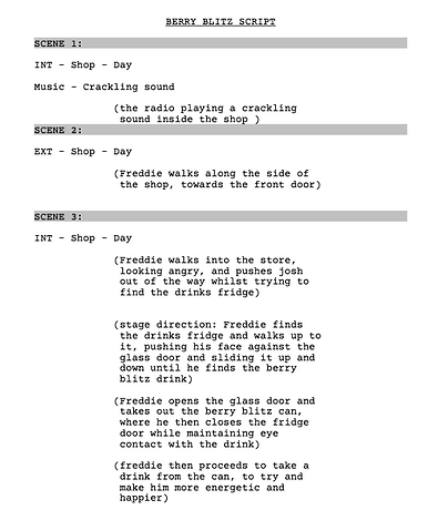
Alongside the Billboard and Magazine advert, we must create a Tv advert, which highlights the drink in a creative and unique way. As a team, we have been able to successfully identify the content that we want to include in our drinks advert, which includes the locations, characters, and props. The first few scenes will be based in a local shop, where an elderly man walks into the shop, angry and short-tempered. From there he starts to walk to the drink's fridge pushing people out of his way, where other customers will talk about how rude he is. The elderly man finds this new drink, ‘Berry Blitz’ and takes it out of the fridge and drinks it. Once drunk he turns into this happy and cheerful young boy, who dances around the shop.
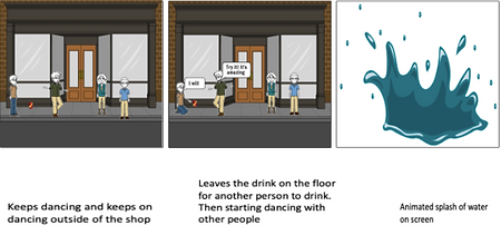
The young boy goes to dance outside of the shop, where the customers follow him, because of the interest they have as to why he has gone from an angry person to a happy young person. The young person convinces someone to have a taste of the drink in which this person does. The final scene is a shot of a beach with the ‘Berry Blitz’ can in the sand where the sea will splash up behind the can making an effect, drawing the attention of the viewer to the drink. Additionally, we will have the slogan above the can as well as our social media on the bottom right corner in the final scene.
The reason we have chosen these locations is that the theme is based around our TV advert is ‘cool’ and ‘refreshing,’ hence why we are going to have a scene on the beach.
The shop does not really have any connection with the theme, however, the fridge that we are going to use in the advert has connotations of ‘cool’ and ‘refreshing,’ with it being a cold object in the shop.
Genre and Style:
Our video advert consists the mix of 2 genres, dramatic and humorous as the main character’s actions are over exaggerated in comparison to common public actions involving extreme misery followed by busting into a dance moments after having a drink of the Berry Blitz, this emphasises a comedic style where by grabbing the viewer’s attention as having a sense of humour in an advert will give the target audience something to look at and talk about.
The billboard and magazine print style adverts are based more around the dramatic genre presenting the drink with a splash of clear water on a sunny beach over dramatizing the image which can help catch the eye of the public.
Social Media:
We want to be able to use social media, so that the target audience and the public will be interactive with the brand, this will be done using Guerrilla marketing and Viral marketing. For viral marketing, we are going to ask are target audiences to take a picture of the most unique summer item that they have in their house, where the top 3 winners will win a free pack of 6 Berry Blitz in the hope that they will like the drink and for them to go on and buy the drink soon.
The magazine advert for the product is also shown to be in the same setting as the billboard advert on the beach with the sunny weather and a splash of clear water behind the can for consistency of are print adverts. Our slogan and price for the drink are displayed in the same format, however to fit the page size, company logos and social media links are now closer to the centre going across the bottom of the page.

Additionally, behind the scenes photos will be uploaded to Twitter and Instagram so that the target audience can see how the Tv advert is being produced. Exclusive live Q&A’s will also be available for the target audience and the public, where characters will share as much information as they can. People can ask questions, relating to the tv advert or specific questions about the character.
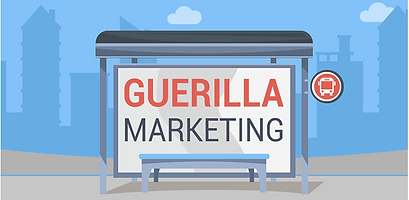
As well as Viral marketing we want to be able to use Guerrilla marketing because we want to interact with the audience in an unconventional way. Are marketing strategy for this, is that we are going to place several 90’s and 00’s objects in a certain area on the beach. A note will be stuck to a wooden sign, explain what they must do. The aim is for the target audiences to find these several items, and once achieved, they will receive a sample of Berry Blitz. The unconventional interaction, will hopefully bring the target audiences closer to the company and the drink.
P3 (U20): Create a pre-production plan for the media components in the planned advertisement campaign
Research into advert conventions:
Target audiences and the public will always have elevated expectations when a new media product is going to be released, one of which is the set of conventions that companies use to have a successful cross-media campaign. An example of these conventions are logos, slogan, date of release, a clear and high-quality focus image as well as an easy-to-read font. These set of conventions apply to billboards, magazines and Tv advert as the company will want to be consistent throughout each one.
The most noticeable convention on any print or online advert is the company name and slogan. Reasoning for this is because companies want to persuade the audience to buy the media product and having a short and snappy phase on the advert will help do this. In terms of the company name, they need to be informed which company is advertising the product and with the company's logo being one of the focus because of the large and clear font, this can easily be recognisable.

A clear and high-quality focus image is another convention that is used on every billboard, poster and Tv advert. Target audiences will expect them to see the product that is going to be created by the company on the adverts. In some cases, the focus image might be a celebrity, which would grab the audience's attention even more because of the company using celebrity endorsement for their product. Additionally, the target audience might be huge fans of the celebrity, so they might follow in the footsteps of their favourite celebrity which would make them buy the product that the company is making.

Another convention that is always found on a billboard and magazine is clear and informative text. Companies do this because they want the target audience and the rest of the public to be able to read the content easily and without any issues. Furthering onto this, the content on the advert needs to be informative as the target audience needs to know what the product is. The information needs to also sell the product to them as well, so having the relevant information on the billboard or magazine will help with that as companies want the target audience to be persuaded to buy the product based on the information that they have been given on the advert.
There are many similar conventions on a billboard and magazine, examples of this would be having clear text, high-quality image, company logo and many more. However, when it comes to a Tv advert, then there are some conventions that are added, which can be more complex than a billboard or magazine convention.
One of these conventions that are used in all TV adverts is the use of mise-en-scene which includes props, costumes, actors, and lighting. Mise-en-scene is used to help make tv adverts look as professional and realistic as possible. Yet, this can be quite a complex convention to add in sometimes but if companies are able to get their mise-en-scene perfect then the Tv advert will be perfect as well. Companies like to link the mise-en-scene to the product that they have created because the audience will clearly be able to see what the product that the company is trying to sell.

The trademark symbol (TM), which is seen next to or above the company logo or slogan, is a convention that all companies use in their adverts. This is where companies trademark a slogan or the design of their company logo so that no other company can steal their designs soon. Unlike copyright, you can renew the trademark every 10 years for a maximum of $400, plus any legal fees that need to be paid for.
Big companies use the trademark symbol so that no other company can copy their design as it was a design that was created by the original company. Additionally, the company want to maintain their heritage going into the future so having the trademark symbol will ensure that will happen.
Researching into competitors adverts:
Sprite:
When planning our advert for our cross-media campaign we thought it was best to look out for our competitors' adverts to gain ideas and information on how we could create our own advert, without breaching the ASA regulations.
Sprite was the first competitor we looked at, where their drink is a fruity flavor that consists of Lemon and Lime. Alongside their Lemon and lime flavor drink, they also produce other flavors such as Cherry, Tropical, Ginger and Lymonade which as a team is useful to us because we will be able to see the distinctive designs, they have done for each of the flavors, so we will be able to gain a variety of ideas and thoughts. Furthermore, having different flavors would give the audience a wider range on what type of Sprite they want, with the company hoping to get other members of the public to buy their drink as well.
The slogan of the advert is noticeably clear due to the typography that Sprite has used. Reasoning for this is because of how big the text is, making it clear for their target audience to see. Additionally, they have used a white-colored font so that the slogan stands out from the blue sky in the background, hoping to make it a primary factor on the poster. The focus of the poster is the Sprite bottle itself, as the whole point of the advert is to promote the product and to gain more revenue from selling the drink. Sprite decided to enlarge the image of the drink so that it would fill most of the page, which would grab the audience's attention and that they would be able to see what type of product Sprite are promoting.
There is a strong link between the product and the background itself due to the colour scheme that Sprite has used for their advert, as the background of the advert is blue, green, and white, in being the same colour as the bottle itself. Furthermore, Sprite is known to be a summer drink so the company wanted to make an advert that had the theme of ‘Summer.’ Sprites’ slogan has a connotation for summer with one of the words being ‘freshness.’ It is not just the background and the bottle that has the same colour scheme, the logo has the colours blue, green and white as well. Sprite cleverly decided to have a half lemon and half lime, put together which is seen on the top right-hand side of the logo.
They decided to do this as Sprites first ever drink to be produced and sold was Lemon and Lime flavoured, so to have the image of the half lemon and half lime would be suitable for the company to use. Keen-eye viewers will be able to see that the dot above the ‘I’ is also the half lemon and Lime as the company wanted to give that unique and creative look to their Logo.
Sprite is renowned for being the European version of Lemonade, meaning that most of the Tv adverts for Sprite are in a European language. The advert that our group were able to pick out had the same consistent message as the poster, whereby there is a group of people that look like to be at a festival during the summer which is a connotation of Sprite. Additionally, there is a scene where a man takes a drink from the Sprite and as he does this, he feels more refreshed and feels fresher than he did before. The idea of being fresh links back to the theme of the media campaign which Sprite was successfully able to do. Costumes from the Tv advert represents the campaign as well because this is something that people would wear when they are on their summer holidays.
Oasis:
Another company, that we considered to be a competitor was Oasis. Just like Sprite, they also produce several fruit-flavored drinks which include Summer Fruits, Punch, Rant Apple, Summer Fruit Zero and Punch Zero. Unlike Sprite, Oasis decided to produce 'Zero’ drinks, which contained no sugar in them at all. Reasoning for this is because they wanted to be able to promote and sell their drink but wanted to give the audience a healthier option.
Oasis is known to be a unique drinks brand and doesn’t like to follow suit with other drinks company. This is evident in one of their latest campaigns back in 2018, which was known as ‘OREFRESHING STUFF’. The company decided to go for a simplistic approach for both their online and print advert as they wanted to get the message across as much as possible. A cartoon effect was used on the poster as Oasis wanted to grab the attention of their mainstream audience, which was 16-24-year-olds. Cartoons are a connotation for the younger audience of today's world, as they like to be entertained in several ways. Furthering on from this, companies who make cartoon Tv programs or posters like to add humor to them, giving the younger audience something to talk about.
When looking at the poster, are group was able to identify that the slogan created by Oasis, was the first thing we saw. This is because of how vast the font size is, as the company wanted to make it easier for the audience to read as well as getting them to focus on the slogan, hoping to persuade their target audience and other members of the public to buy the product that Oasis were promoting. It is not just the size of the font but also the coloring of the font, which makes it stand out more. The company used white as the font color, to contrast the red splash in the background, so that the audience would not be distracted by the background itself. Adding onto this, Oasis used direct address in the slogan itself with the phrase “YOU’RE THIRSTY” making it bigger than the rest of the text, therefore having a phycological effect on the audience because it puts the emphasis on the word “YOU’RE”, showing that the company are directly addressing the person that is viewing the poster.


Oasis wanted to state the flavour of drink as much as possible and they were successfully able to do this, by having the background colour of the poster red. Taking into consideration that the flavour of the drink is called ‘Summer Fruits,’ the red background is a connotation to the flavour of the drink. This is because when we say or hear the word ‘Summer Fruits’ people automatically thing of fruits that are red such as water melon, Strawberries, Raspberries, Cherries and Blood Orange.
The Genre and style of the Tv advert that Oasis made for the media product, is realistic. They wanted to sell the product in a straight forward manner and without having any distractions in the background. There was a voice over who joked about other competitors adverts and the use of celebrity endorsement. A consistent message was brought across from the poster to the Tv advert by the company directly addressing the target audience and other members of the public. The typography and the colour scheme that was created for the poster, was the same for the Tv advert keeping that consistency throughout the campaign itself.
Gantt chart:

As you can see from the image above, we have created a Gantt Chart. Reasoning for this is because we want to be able to complete all are tasks efficiently and done by a specific deadline, which would then give us enough time to edit are Tv Advert. Furthermore, it enables us to be organised as we have assigned numerous tasks to one another and to manage each other's tasks as well, if something were to happen at any given moment.
The numbers on the left-hand side of the chart represent the following tasks:
1 = Mood Board
2 = Storyboard
3 = Sketched Draft Designs
4 = Research into competitors’ adverts
5 = Research into advert conventions
6 = Video ad treatment
7 = Proposal
8 = Legal and Ethical practice
9 = Contingency Plan
10 = Shot List
11 = Model permission
12 = Location Recce
13 = Location permission
14 = Risk Assessment
15 = Shoot Video Advert
16 = Take image for magazine advert & billboard advert
17 = Edit Video advert
18 = Audience feedback on the cross-media campaign
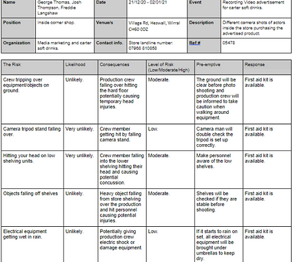
Risk Assessment:

Shooting Schedule:


Location Recce:

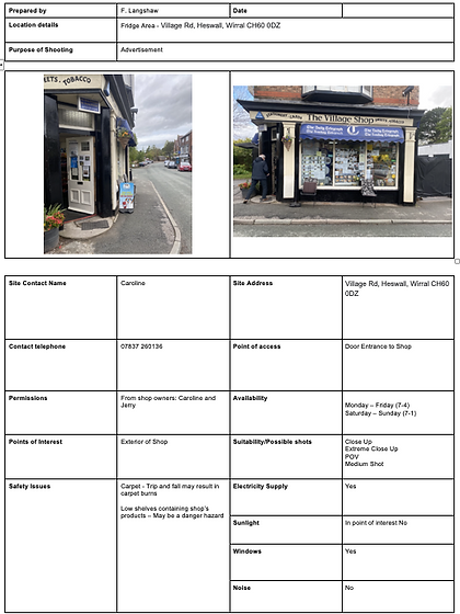
Location realise form:

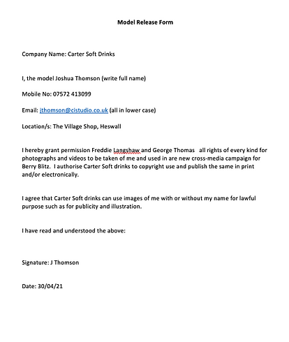
Model release form:
Music Release Form:

Script:

Shot list:


Storyboard:


M2 (U20): Justify the choice of planned components by a targeted media sector
Video Presentation:
D1 (U20): Discuss legal and ethical constraints within the planned campaign
One main code from the ASA (Advertising Standers Authority) to take into considerations when producing both our broadcasted and non-broadcasted is ‘03 misleading advertising CAP code’. This states that ‘Marketing communications must not materially mislead or be likely to do so,’ it is important that our advertisements do not breach this code by not presenting any additional products alongside the main can drink being advertised as doing so may imply that other items are brought alongside the main product without extra charge. To respect the code, it is also necessary that the product is advertised correctly with the correct price, delivery charges and main characteristic of the product, for our certain position this means we must advertise a strawberry flavored fizzy drink for 50p per can, so we do not mislead are target audience and the public.
All preformed advertising when broadcasting and non-broadcasting must not cause ‘serious or widespread offence’ under the CAP code ‘04 harm and offence’. The code revolves around the basis of treating certain topics that are presented in an advertisement in a careful manner to avoid causing offence such as age, sex, religion, sexuality etc... Doing so would lead to mass numbers of complaints from the audience which can result in the advertisement taken down. We must avoid uploading content that could be considered ‘grossly offensive’ online so that we do not run into any legal issues regarding section 127 Communications act 2003.
Another area in which we must take into consideration regarding what is ethical when producing our advertisement is the use of data CAP code. Personal information about personnel involved with the advertisements must be kept from the advertisement. When collecting information on consumers marketers must provide the consumer with the following information in a privacy notice.


While producing the video adverts for our product we must be fair to other competitors where their prices are described accurately, and rules should be made clearly well-known under the BACP code ‘28 competitions’. Other drink brands presented in our video adverts cannot be misleading to the viewer but shown in a fair way as this would be unethical of the company and build a negative reputation when in comparison to other competitors though presenting false information in our adverts.
We must take caution when using already produced content within our advertisement to avoid running into legal issues revolving around copywritten content. The Copywrite design and patents act 1988 allows for the legal protection of created content, the creator of Dramatic, musical, literary, and artistic work control who and how their material is used. Release forms will be signed to provide us with evidence of permissions of use for any copywritten content we are to use.
Regarding the code ‘05 Children’ for both broadcasted and non-broadcasted content, it is stated that children under the age of 16 much be protected from advertising that will lead to or directly cause physical and or mental harm. It is important that we take this into consideration we producing the advertisements messaging as all our adverts will be displayed in public spaces meaning that even though under 16s are not the target audience of the drink, they will still be able to view the advertisements. The way in which we carry this out is by not producing content that could encourage bullying, condone or encourage practices that would cause major harm to a child’s health or wellbeing.
The code for broadcasting advertisements ‘09 environmental claims’ advises us to stick to government guidelines regarding the Green Claims Code published by DEFRA and BIS. Any environmental claims made in the advertisement must be supported by high-level substantiation. As much of our advertisement is not based around this dilemma, it will be easy to avoid running into any legal issues under this code with the government.
There are prohibited categories that cannot be shown on TV, it will be important while producing the video advert that we do not feature or advertise any of these products. Example of prohibited products is breath-testing devices and products that are intended to mask the effects of alcohol, all tobacco products, guns (including replica guns) and prostitution as well as sexual massage services. The full list goes on and must be read through when creating the end video advert.